The wordmark
The i and t drawn as a figure seated at a desk, plus a version with the tagline Innovative Workspaces.
 Back to homeElite

For Elite, an office furniture brand in Riyadh, ORIGIN drew the i and t of the name as a figure seated at a desk.
Office furniture starts with one person: the one who sits at the desk. Could a name start there too?
The identity had five jobs to do.
A name that says office, person and premium at a glance, in black and white.
Its own product library did not exist yet. The brand had to look premium on type alone.
It shares catalogs and posters with a global partner's mark, at equal weight, two letters apart.
Saudi organizations read English and Arabic. Every rule had to work in both.
Mature, classy, smart, strategic, modern and artistic.
One mark for a stamp and a favicon, and the same mark across a facade.
One person, one chair, one desk. The name already held them.
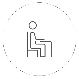
The person every Elite workspace is made for.
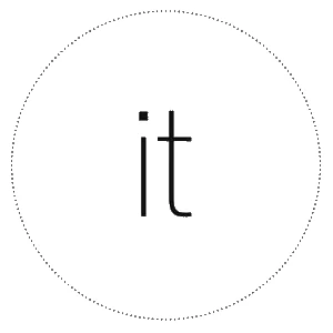
Two letters already sitting in the name.
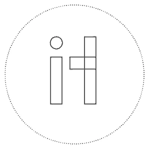
Squared off, the i reads as a person and the t as the desk beside them.
The logo rationale, page 9 of the Elite brand guide.
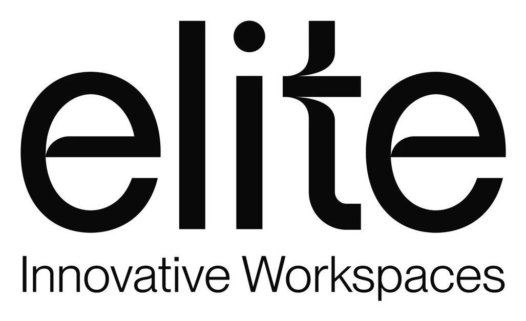
The person is in the name.
Want a name your customers can see themselves in?
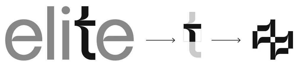
Price your projectThe guide breaks the mark into equal parts and repeats the t with its inverse. Tap the tiles and build a pattern of your own.
Black, white and gray carry the personality. One accent color at a time, at full strength, never more.
Neue Montreal for English headlines and body. RB and Helvetica Neue LT Arabic for Arabic, with typesetting formats in both languages.
Personality, in six wordsMatureClassySmartStrategicModernArtistic
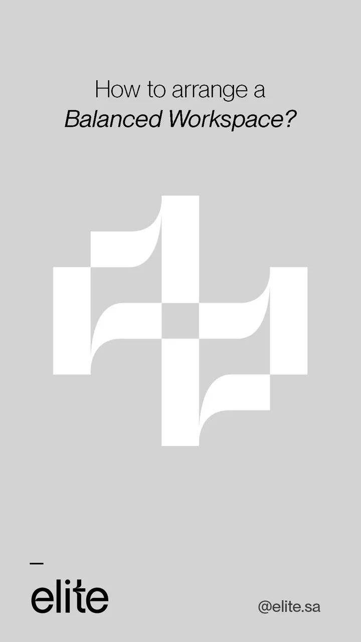
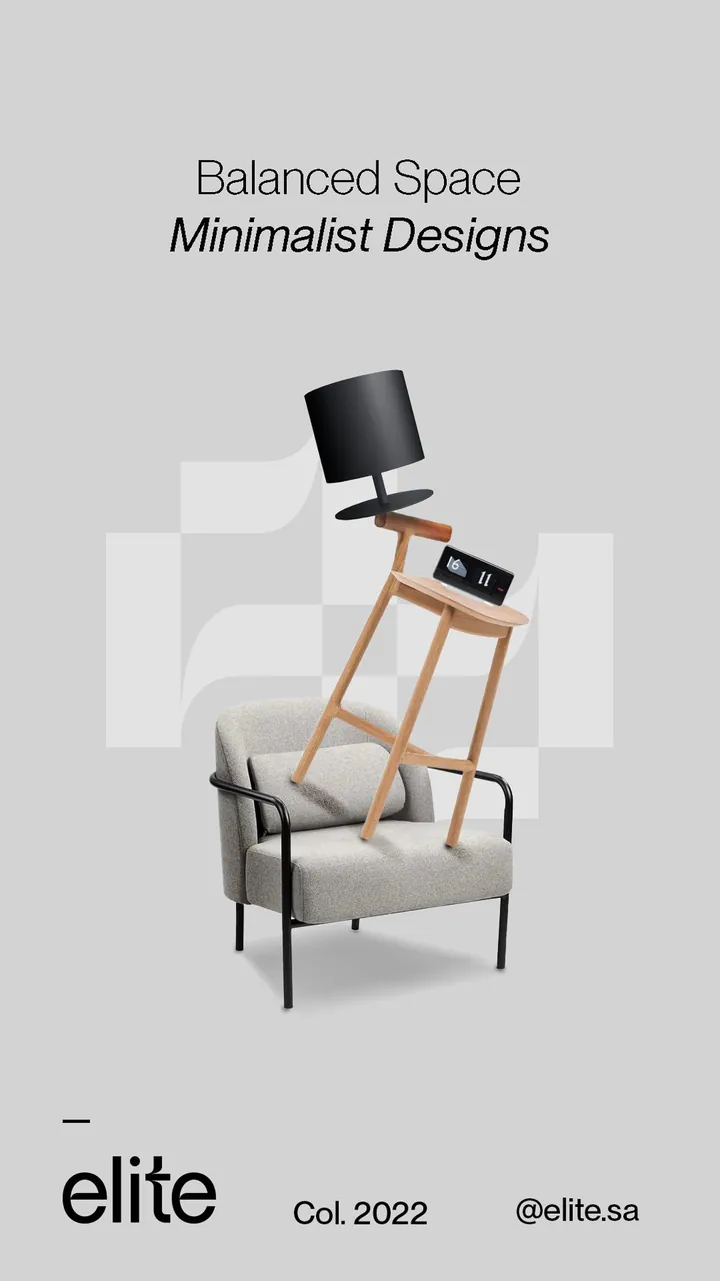
A key visual in two parts, both built on the symbol: a question, then the answer.
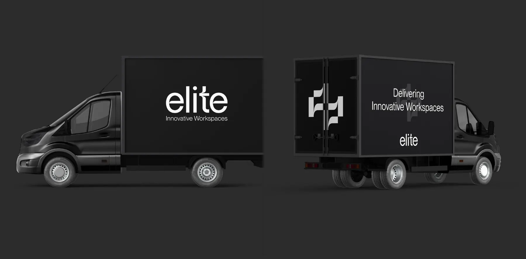
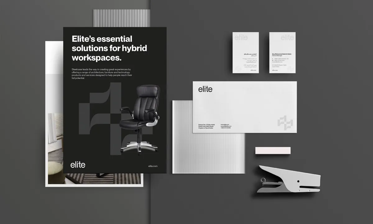
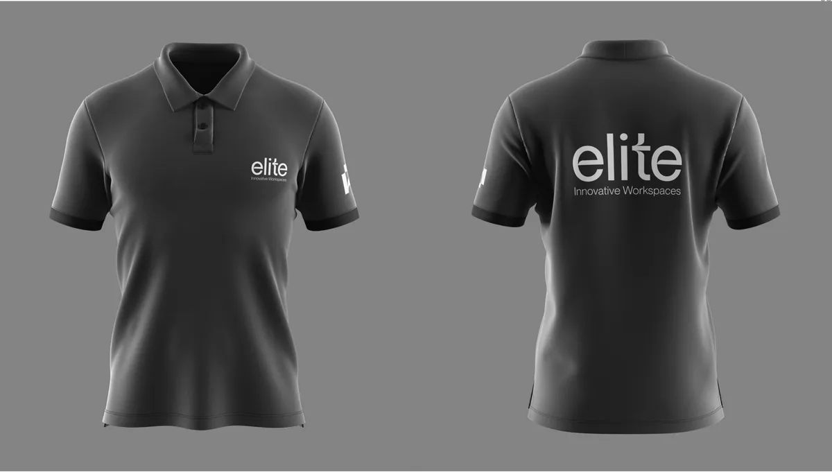
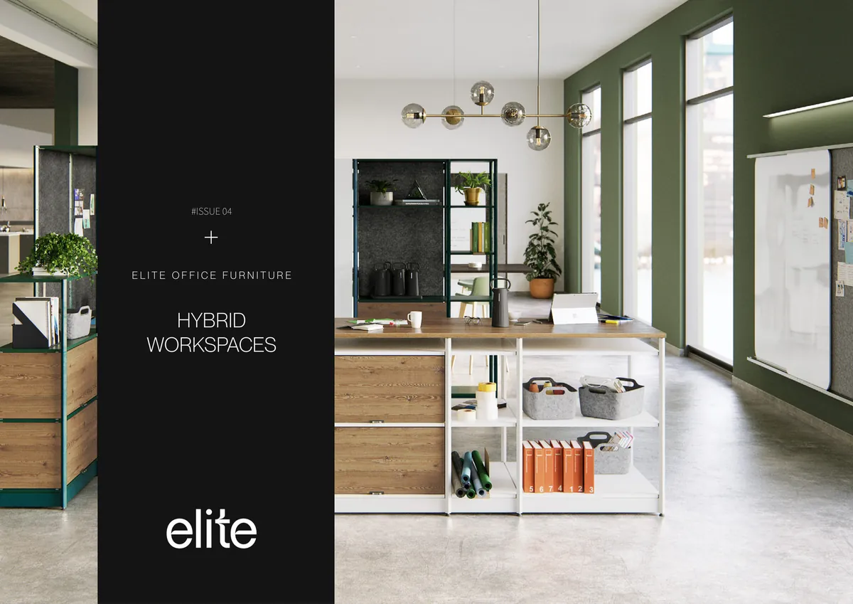
One idea, carried from five letters to the front door.
The i and t drawn as a figure seated at a desk, plus a version with the tagline Innovative Workspaces.
The t and its inverse, for small uses: favicon, stamps, pins.
Black, white and two grays, with 18 accent colors used one at a time.
Neue Montreal for English; RB and Helvetica Neue LT Arabic for Arabic, with typesetting formats.
A key visual element and four pattern studies built from the t.
Logo rules, co-branding, colors, type, visual language and applications.
Business card, letterhead, envelope, folder, invoice, lanyard, tote and polo, as templates and mockups.
Signage, vehicle, catalog and profile layouts, and a teaser and revealer.
Want a name your customers can see themselves in?











SAR 55,984
A 30 minute call with Razan Nafeh
SAR 121,175
A 60 minute call with Eman Zahran
SAR 415,938
A 60 minute call with our Founder
An accurate quote follows once we understand the full scope.
Talk to our teamAlso in the package before it New in this package
Prices in SAR, before VAT.
Yes. Elite shares catalogs and posters with a global partner's mark, so its guide sets co-branding rules: equal weight, and a gap of two letters between the marks.
Yes. Elite's identity carries itself on type, black and white, and one pattern, so it works while the photo library is still being built.
Yes. Elite's guide sets type rules for both: Neue Montreal for English, and RB and Helvetica Neue LT Arabic for Arabic.
The full system adds color, type, imagery and rules to the logo, with guidelines every supplier can follow. We do not design a logo on its own: every identity comes with its system, colors, typeface and brand guide. The brand health check shows where your brand stands today.
First concepts arrive in 10 working days. The full timeline depends on the package and is confirmed in your proposal.
We agree the brief in writing first. If the first concepts miss it, you get a full second round at no cost.
Each package shows its price in riyals, before VAT. Your final price comes with your proposal, written for your scope.
Want results like Elite?