Reframing real estate development
The Experience
- Brand Building
- Brand Production
The scope
- Brand strategy
- Identity design
- Brand development
- Visual brand language
- Digital design
- Print design
- Visual production
- Marketing materials
About Alaqtar Real Estate
Venturing beyond the norm
Alaqtar, a prominent real estate development company in Saudi Arabia, is redefining the industry with its strategic vision.
Focused on targeting secondary cities and untapped markets, their business plan prioritizes regions like Qasim, Al Ahsa, Dahran, Jazan, and other villages in the south of Saudi Arabia.
With ambitious and visionary leaders at the helm, Alaqtar aims to:
Under new leadership, Alaqtar seeks to revitalize its strategy and brand identity with a fresh vision, positioning itself for a new approach.
What we had in mind
The thought process
To create a new brand identity for Alaqtar, we conducted extensive market research, including a thorough real estate analysis with a focus on the housing sector in Saudi Arabia.
We identified a highly competitive market amidst the ongoing housing boom and its significant growth potential.
Our goal was to develop a strategic brand positioning that would set Alaqtar apart from competitors and establish a distinct identity in the market worldwide.
Our vision for Alaqtar Real Estate
A leader in the real estate market, blending contemporary innovation, wisdom, and tradition to forge a long-lasting reputation.

How we made it happen
Brand identity
Resonance to culture
Alaqtar's new brand aims to blend Saudi cultural heritage with modernity, appealing to young Saudis and expats who value stylish, contemporary brands aligned with their values and traditions.
Visualizing the logo
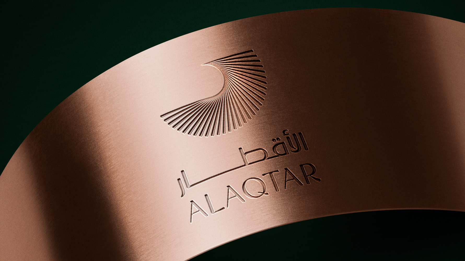
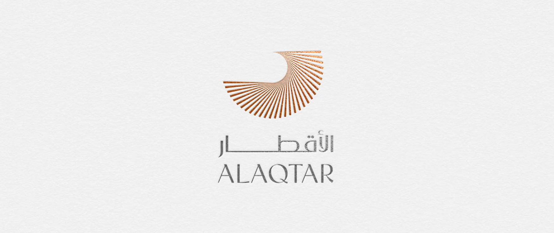
We wanted to create a simple and minimalistic logo design for Alaqtar that entails:
- Sleek, modern design: Alaqtar's logo is crafted to be sophisticated.
- Falcon symbolism: an abstract falcon represents Arab culture, embodying speed, agility, sharp vision, and loyalty.
- Circular grid emblem reflects the brand's name "Alaqtar” meaning “diameters.”
- Sharp-edged lines: symbolize structure and dynamism, enhancing the brand's elegant and sophisticated appearance.
From monolithic to diversified
We moved from a single house-focused brand to a multi-brand approach for distinct projects and community identities.
We proposed two models for this diverse brand strategy:

The voice of truthfulness
Alaqtar's tone of voice tells engaging stories, showcasing not just properties but lifestyles and cultural opportunities.
With curiosity and community insights, it speaks authentically and thoughtfully, aiming to inspire deep reflection instead of just selling.
Alaqtar’s tone of voice embodies ambition, excitement, intelligence, confidence, personalization, and courage.
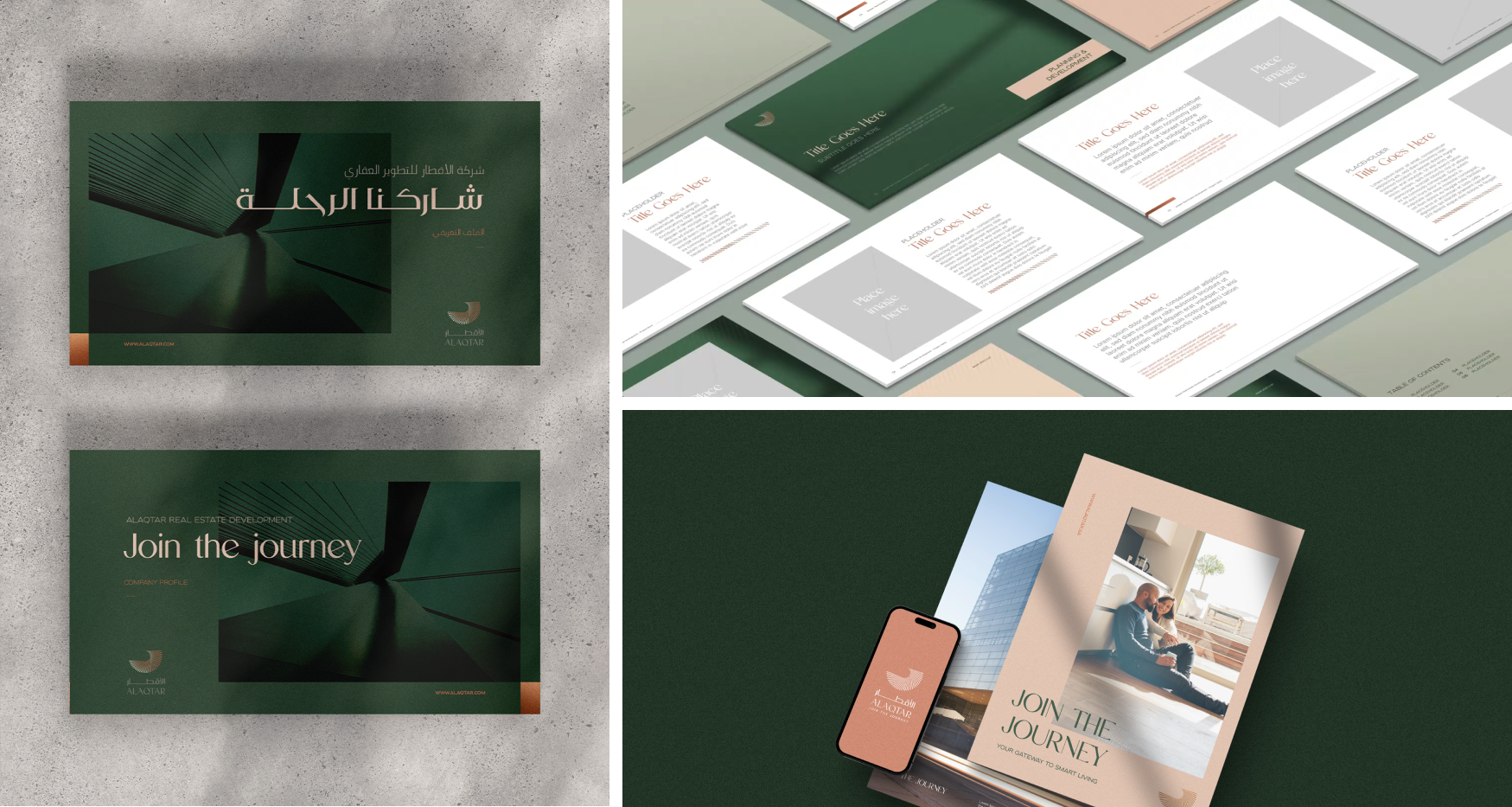
Creating the bilingual profile
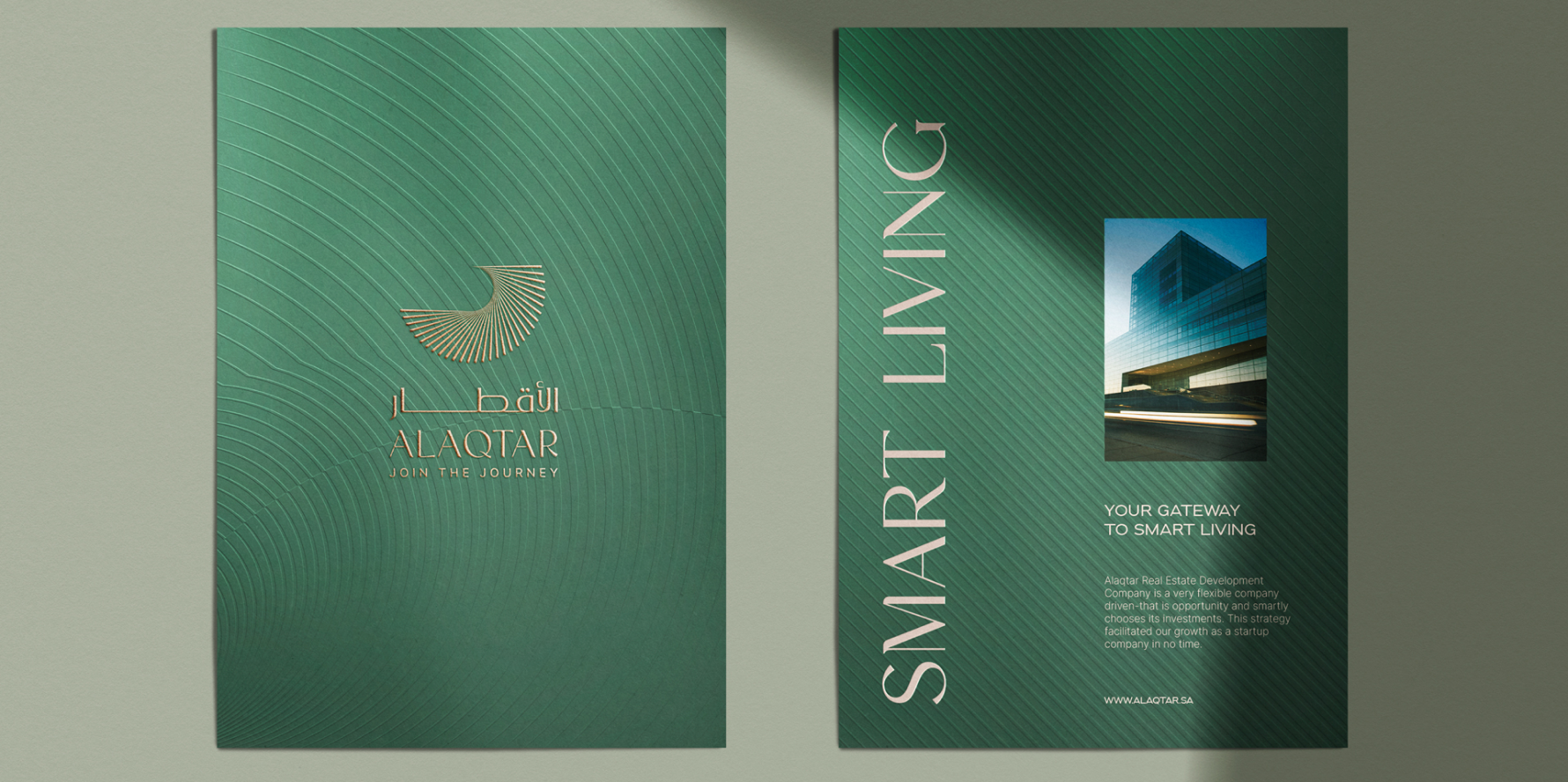
Weaving Alaqtar's essence into an intricate blend between the English and Arabic languages, our crafted profile resonates with modern sophistication, artfully balancing storytelling and insight to captivate and enlighten both a local and global audience.
Guiding the brand
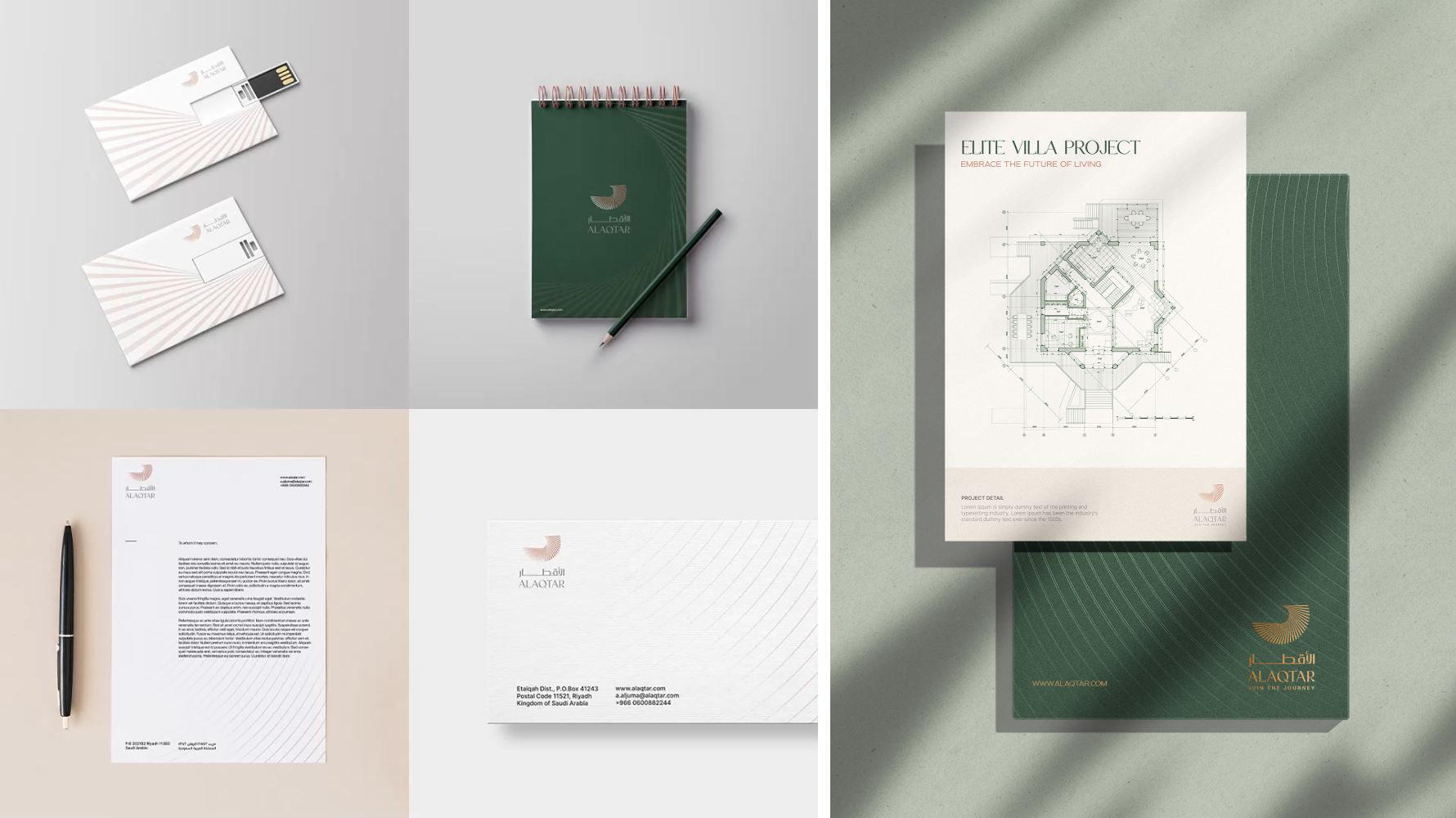
We created a brand book that serves as a go-to guide for creating Alaqtar's communication tools. We've put together a document with logo guidelines and updated brand assets like colors, fonts, graphics, and photography style.
This ensures a consistent and professional image across all platforms, helping Alaqtar communicate its identity effectively..
